May 2nd, 2021 at 11:34 am EDT
How good of an idea is a gas gauge that only reads “yes” or “no”? How about a restaurant whose menu only tells you whether they “do” or “don’t” have food today? Binaries are the pre-school of information. So what in the actual hell are we doing every election season, then? We allow blue and red maps to cosplay as accurate scoreboards. Elections are society’s most important data dumps, yet we still settle for red, blue, and nothing-else maps.
The consequences of our self-imposed idiocy are real. At the start of 2021, 75% of Trump voters believed that Trump either “probably” or “definitely” won the presidential election, and 35% were “unsure.” A quarter into the year, around 60% of Republicans still believed Biden “stole” the election.
See, they know Biden stole the election, and they know it to this day. After all, all the maps, they’ll tell you, clearly show the majority of the country is Republican, obviously. Trump even had his map from 2016 framed. The popular vote loser, he really was interested only in the real estate.
Legal challenges to states’ 2020 election results have been delusional, feverish, and long-running. Equipped with their Big Lie, Trump’s legal team has failed in every single attempt to overturn state-verified data, including in Republican strongholds. Trump-appointed judges, even, lifelong Republicans, were dismissing the lawsuits because, repeatedly, prosecutors provided exactly no evidence. The last one, a case about Pennsylvania, the Supreme Court dismissed. In late April. The year after the election.
And then there was that whole coup. That whole “kill everyone and overthrow the government” thing. You know the one.
Delusions’ presenting in over half of the Republican party didn’t start election night with the cherry-red maps on screen — but those elementary images sure didn’t help. Watching anchors marvel and wax philosophic over the sea-to-shining-sea accomplishment of the modern Republican, wouldn’t you chirp and coup, too? Hell, Amazon will even sell you a poster.
Beyond the suing, other fuckery is afoot, too. GOP lawmakers went on to rationalize Georgia’s new voting restrictions this year by framing their actions as a counterattack on 2020 mail-in voter fraud — fraud we know didn’t happen and would not have been easy to make happen, anyway. Still, far-right Republicans were able to sell suppression branded as justice. If not through fraud, they asked, how else could Biden have won their hyper-red state? Certainly not at the hands of actual Georgians fed up with Republicans.
Don’t get me wrong — the shifty machinations of the far-right have enough precursors to fill an apocalyptic arc twice over. I suggest that, among myriad interventions, we consider the damage from “frame one” of the reel, too: the dumbest maps of the results.
In the late nineteenth and early twentieth centuries, election maps for the purposes of newspapers and print media started to become fashionable. As National Geographic reported following the 2012 election-data season, voter numbers first got an overhaul in United States media, moving from prose and characters to images and colors, after our 1880 election.
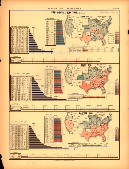
Even early examples added shade. Framing the modern commercial break, our graphics have actually regressed from a nineteenth-century standard.
Princeton and Drexel University researchers this February felt they had to update the 2-D, budget-world map disgruntled geography teachers have been pulling down over their blackboards for the past century. What’s new? The cartographers designed it as unavoidably two-sided. How else could you even begin to represent a sphere accurately on the page? Suddenly it makes sense that Alaska is just a “Palin-glance away” from Russia.
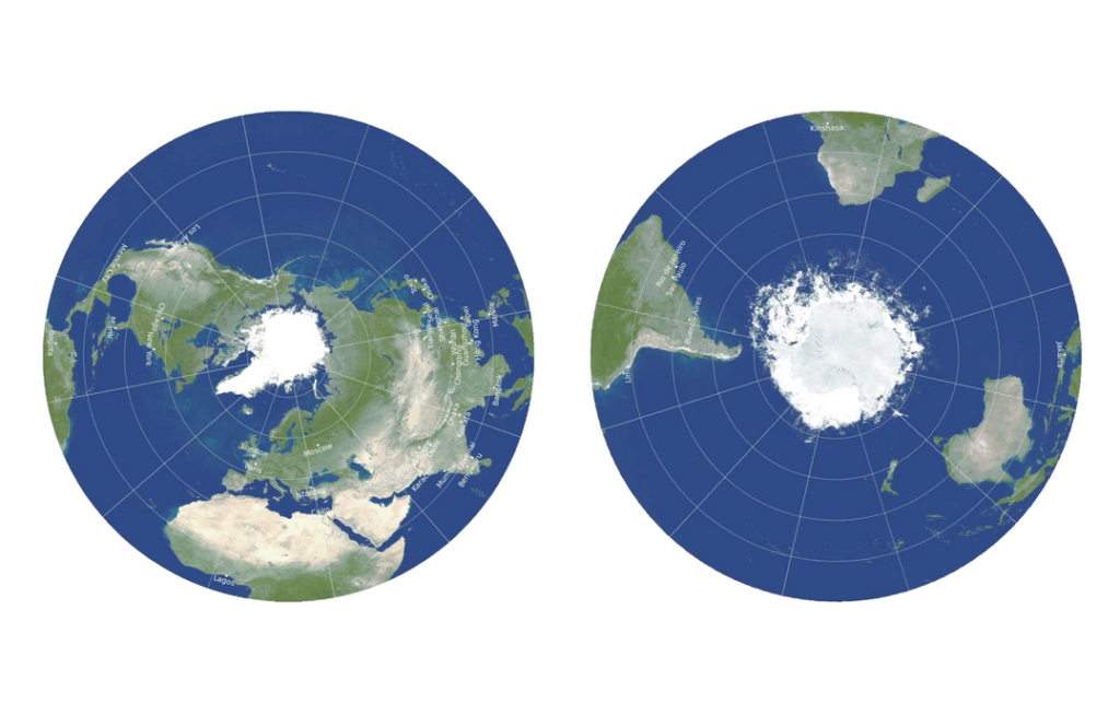
To any would-be flat earthers, know that this is a flattening for the sake of two-dimensional screens and paper only. An actual globe is, still, most accurate, so don’t award yourself a Ph.D. just yet.
Anachronistic choices in data visualization churn cognitive mud, while better choices help to answer questions like how it was that, in a field of almost all red, Biden was not just close to the total votes he’d need to win the Electoral College but well past it — by a margin of 7 million. A shipping route through the Arctic, from Canada to Asia.
Freelance data-lovers and career data-scientists on the subreddit “Data Is Beautiful” seem to have no problem offering new, more transparent ways of representing new data. The months of posts following the 2020 election met every expectation.
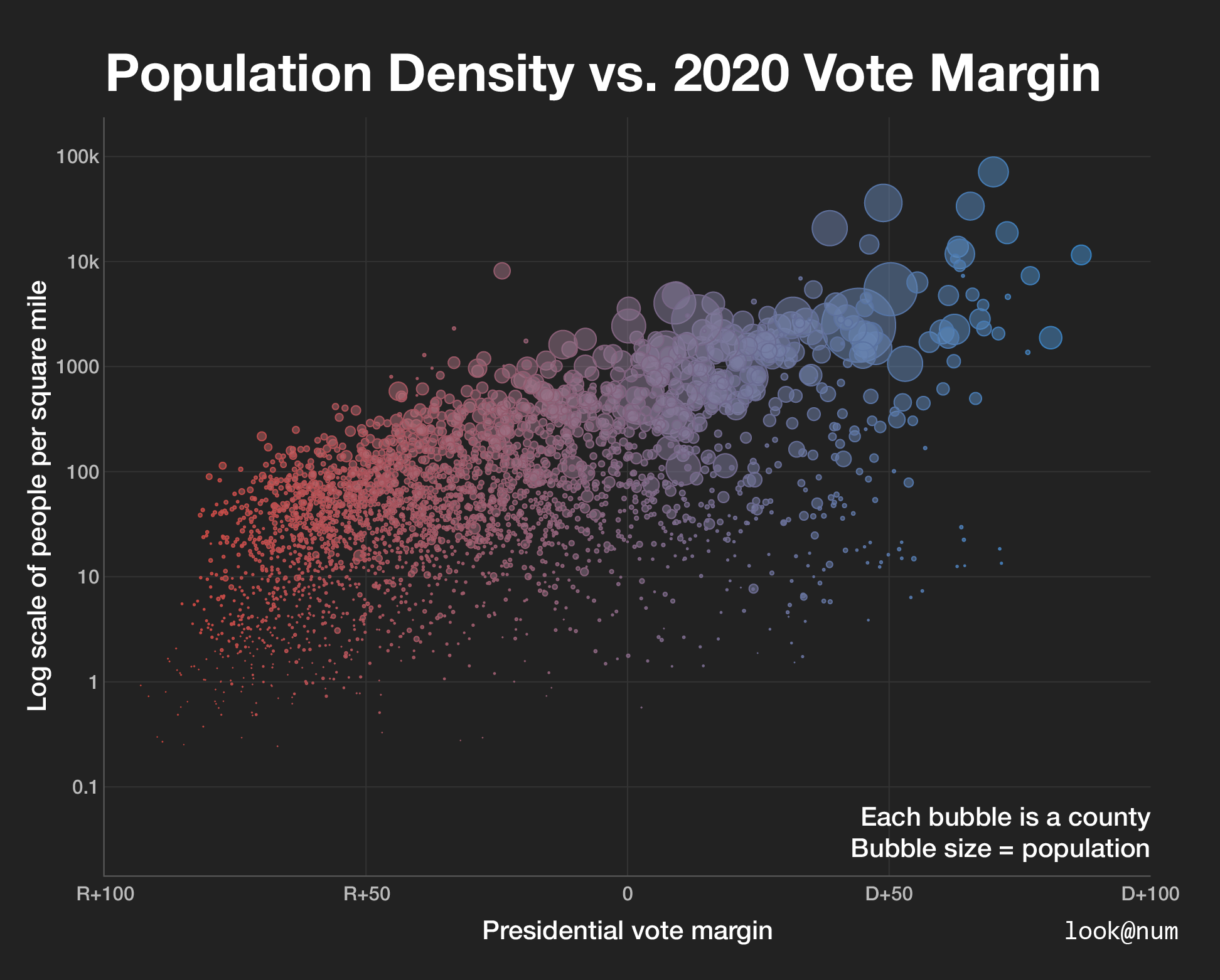
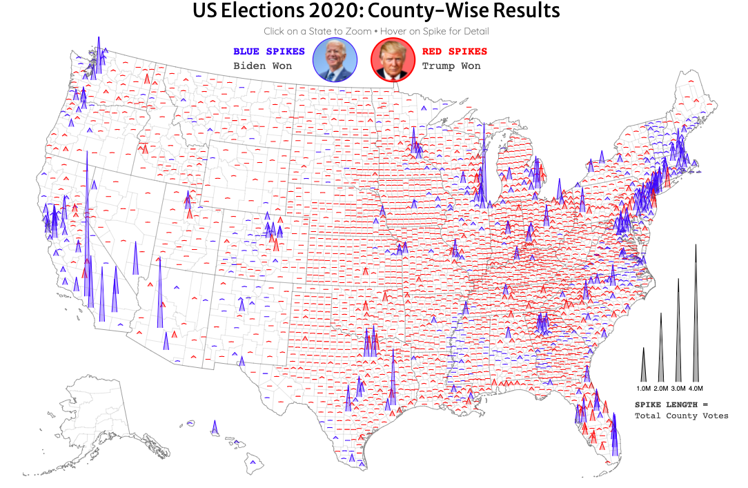
Take this post from December. The graph visualizes the margins of win from every county in the country, one dot per county. The color-coding is intuitive, completely self-explanatory. Big circles are bigger populations. Get it? Yeah.
Or this one from November. Same color-coding. Same sizing idea, but for how many people actually voted in each county as opposed to the total population. Get it? Yeah.
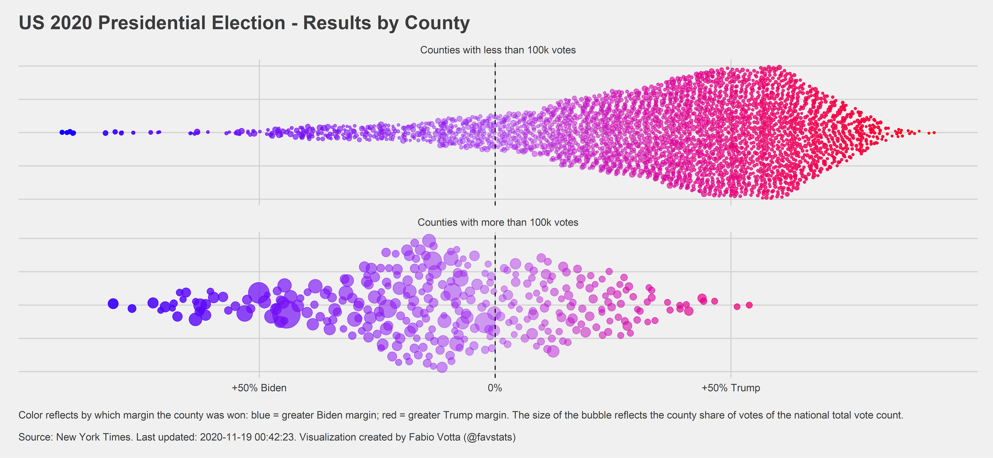
Yes, “small” counties, in both senses of the word, are typically redder than large ones, and yes, a dozen large blue ones build and accrue right past a hundred small reds. In fact, there aren’t any large red counties. In both maps, these plain-as-day rural vs. urban realities become clear — which we can’t say of traditional maps, even — as does the potency of Biden’s campaign.
How about a kind of, “Google Earth to our Google Maps” post? This map visualizes vote totals in their respective county locations via height, adding quite literally a third dimension to what otherwise is only two.
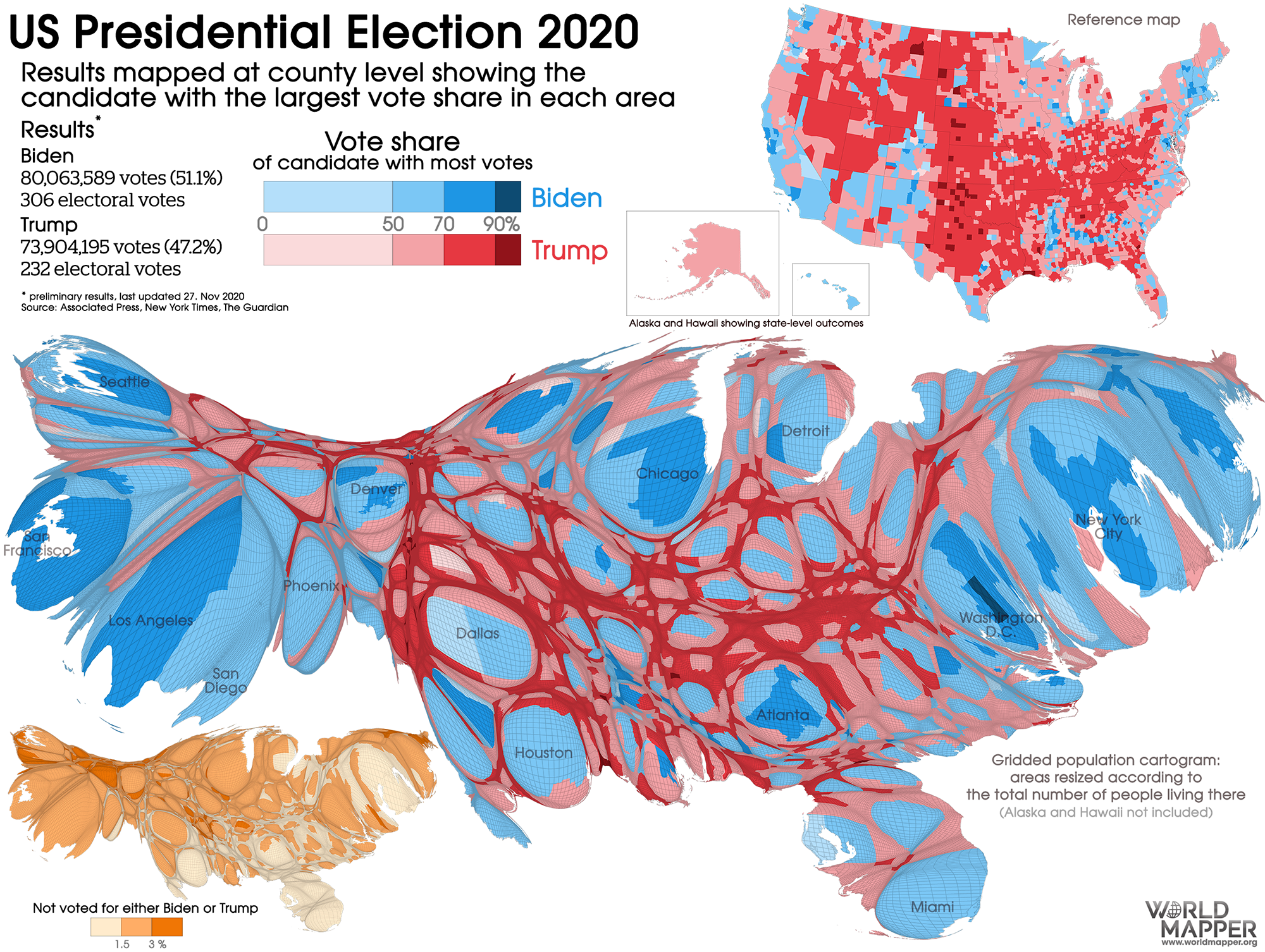
Better data representation isn’t exclusive to reddit. Some is already so standard among statisticians that it has a specific name. Consider the “cartogram”, a map broken into territories, each undergoing a resizing based on influence or a share of some kind (as opposed to the actual square footage and borders represented by traditional maps).
Worldmapper, a nonprofit that specializes in replacing dated maps specifically with cartograms, posted these messy but accurate offerings for the 2020 election. Suddenly Florida and Texas don’t look so universally Republican.
And in a 2019 viral tweet from data scientist Karim Douïeb, the standard map from 2016 got an animated upgrade, too, adding the fourth dimension of “time” to the experience, a blossoming.
Douïeb amended the animation after posting, having based his first version, he said, on a confidently incorrect “Impeach this” tweet from Lara Trump. His correction was even more damning.
Our reliance on antiquated maps is as mystifying as a flat-earther using GPS to find the nearest Planet Fitness without any sense of the irony.
We have a precious few defenses against misinformation campaigns right now. Math-hating and number-averse, we American simpletons put out a welcome mat especially for disingenuous guests. QAnon forum admins salivate over our inability to handle the hard, often boring data of the daily world. We found out this year that overseas trolls mainly from China and Russia account for a whopping fifth of all QAnon misinformation. The Cold War equivalent would be, if one or of every five people in a small-town American bar were a Russian spy. Drunkards and dullards, we are.
In all of our more true-to-reality maps, Biden appears to have had more than a fighting chance, even our least observant can see, and may have won even handily (he did). The typical two-dimensional map gives no such quickness of understanding. I will not repurpose the 2020 one, here, in the same way that I wouldn’t read your humors and prescribe a tonic. If immediacy and impression of conclusion are at all measures of data successfully visualized, then only with new methods like those above do we even begin to approach success.
There is nothing inherently accurate and clear about any one representation the media may offer. Journalist translators must compress raw data into accurate, digestible images and animations that minimize the necessary processing power of the brain engaging the screens on the other end. That process, an art as much as it is a science, is as fallible as people are.
As calculus was to algebra, one day we may find a new, derivative election-data dimension also worth exploring. Until then, anything less than the inherently more informative expressions of data above or ones like them must by definition be an outright misrepresentation based on what we know and can know, design and can design as of the twenty-first century.
Voters’ ongoing disbelief in democratic results is more than a fluke, more than an intentional effect of blazing right-wing rhetoric, or purported left-wing overreaching. It’s more than force or fate. It’s in part an anti-democratic choice. Our media have a choice in how each broadcaster or publication decides to represent data, both at the top of the broadcast and throughout, and we have a choice in telling them how we feel about it, voting with our remotes. The media’s choice unilaterally has been to renew continually, if not exclusively, an untelling and dangerous format for at least part of their broadcast.
Why?
A few journalists’ bad idea ages ago need not be our standard in 2021. There is nothing, nothing at all sacred or inherent to the standard election cartography that makes it an accurate choice each election. What it was, always, was easy, a lazy, uneducated way to add literal, primary colors to a story or newscast.
We should want to see and know what our preferences are, compiled and visualized accurately, from party votes to local policy. We are still a species dominated by its favoritism for simplicity. We struggle to understand the magnitude of large scales, and are utterly useless when it comes to exponents and even basic gambling odds — standard math. We rest easy with “black or white” thinking, grow anxiety disorders in gray. We commit logical fallacies discovered millennia ago over dinner conversation on a Tuesday.
A supposedly intelligent species, we can be better. Here’s a start: never again show the map that shall not be named. Like most black magic, a solid amount of demons I’m told, and Beetlejuice, the map can’t do anything unless we call it into existence.
So shush.
Standard election maps, seas of red, coasts and cities of scattered blue.
THE SIFT
We now have example after example of more accurate representations of data. Many are so immediately accessible and helpful to the average voter trying to follow the news that to continue to use the old standards, even in part, borders on journalistic malpractice, enabling and abetting any who wish to keep voters less informed by default.

Ryan Derenberger is a freelance journalist and editor, a Journalism and AP Language teacher at Whitman HS in Bethesda, MD, and the founder of 'The Idea Sift.'